FRAMER
Detailed Case-study with Design
Conference App for an African agricultural association.
My Role.
As the lead UX/UI designer for the AFCPA mobile app,
I managed the design process from research to final implementation. I conducted user research with over 50 participants, developed wireframes and prototypes, and collaborated with a cross-functional team to ensure the app was functional and visually appealing. I also led usability testing, which reduced user errors by 40% and increased satisfaction by 25%. These efforts contributed to a 60% increase in app adoption compared to previous conference tools.
Bridging the UX Gap.
The primary UX gap we aimed to address with the AFCPA mobile application was the lack of a centralized, user-friendly platform for conference participants. Previously, attendees, speakers, and organizers had to navigate fragmented sources like emails and websites, leading to confusion and inefficiency. Our goal was to create an all-in-one app that seamlessly integrated schedules, speaker info, and exhibitor details, streamlining the conference experience for everyone involved.
Problem Statement for AFCPA.
Conference participants often struggle with fragmented and outdated methods of accessing critical event information, such as schedules, speaker bios, and exhibitor details. This leads to inefficiencies, missed sessions, and a general lack of engagement. For an African agricultural association like AFCPA, where timely access to information and seamless coordination are crucial, these challenges are even more pronounced. The need for a centralized, user-friendly mobile application is clear—to streamline the conference experience, provide real-time updates, and ensure that all participants can easily access and manage the information they need to fully engage with the event.
Why Do We Require an App for This Problem?.
An app like AFCPA is essential for streamlining the conference experience for all participants—attendees, speakers, and organizers. Traditional methods of managing conference details, such as printed schedules, emails, and websites, are fragmented and often lead to confusion and inefficiency. A dedicated mobile app centralizes all relevant information, providing real-time updates, easy access to schedules, speaker details, and exhibitor information, all in one place. This not only enhances the user experience but also improves the overall organization and management of the event, making it easier for participants to navigate and engage with the conference activities efficiently.
To ensure the AFCPA mobile application met the diverse needs of its users, we began the design process with comprehensive user research. The primary goal was to understand the specific requirements, pain points, and expectations of different user groups involved in the conference.
All the research methods were instrumental in shaping the design and functionality of the AFCPA app, ensuring it addressed the specific needs of each user group mentioned below while enhancing the overall conference experience.
After extensive research, we identified the need to create three distinct user personas: conference attendees, speakers, and organizers. These personas were developed because each group has unique needs, goals, and challenges that must be addressed to ensure a successful and seamless conference experience. By understanding the different backgrounds and requirements of these user groups, we were able to tailor the AFCPA mobile application to meet the specific demands of each, enhancing the overall effectiveness and usability of the platform.
After developing the personas, we conducted deep research to understand their specific needs and potential challenges. We then created three user journey maps—one each for attendees, speakers, and organizers—to visualize how these personas might navigate the conference, where they might face obstacles, and how the AFCPA app can meet their diverse needs.
We developed a clear information architecture to structure the AFCPA app, ensuring all content was organized effectively. The focus then shifted to identifying the user flow, mapping out how each persona—attendees, speakers, and organizers—would navigate the app. This user flow ensured a seamless journey, allowing users to easily access schedules, manage sessions, and receive updates without any friction.
Before diving into digital wireframing, I believe in starting with basic sketches. This approach allows me to quickly visualize ideas, explore different layouts, and iterate on designs without the constraints of digital tools. For the AFCPA app, I sketched out the core screens and user flows, which helped in refining the concept and ensuring that the structure was intuitive and user-friendly before moving on to more detailed wireframes.
We initiated the design process by creating wireframes for the key screens of the AFCPA app. These wireframes were crucial in shaping the app's layout and functionality, allowing us to refine the user experience early on. This step ensured that the app’s navigation was intuitive and met the needs of attendees, speakers, and organizers before moving forward with detailed designs.
During the design process for the AFCPA app, we initially created a set of screens based on our wireframes. However, after presenting these designs to the client, they requested changes that required us to go back to the drawing board and create a new wireframe. Although these designs were ultimately not used, they represent an important part of the design journey. They showcase our commitment to exploring different approaches and our willingness to adapt based on client feedback. Including these rejected screens in my portfolio highlights the iterative nature of design and the importance of collaboration in achieving the best possible outcome.
For the initial AFCPA app design, I chose two color palettes that reflected the agricultural theme.
The first—yellow, orange, white, and brown—was intended to evoke warmth, growth, and earthiness, symbolizing the natural elements of farming. The second—green, black, and white—represented nature, vitality, and modernity, aiming to connect with the audience through colors strongly associated with agriculture. Although these designs were not selected by the client, they were thoughtfully crafted to align with the conference's theme and enhance user engagement through color psychology.
After reviewing the initial design with the client and receiving their feedback, we went back to the drawing board to develop a new set of wireframes and sketches. This second approach focused on aligning more closely with the client’s vision, incorporating their specific requests and addressing any concerns they had with the first concept. These revised wireframes reflect a more refined understanding of the project’s goals, ensuring that the design not only meets the functional requirements but also resonates better with the intended audience. This process highlights our commitment to collaboration and iteration, ensuring that the final product is both effective and visually appealing.
Surveys: Distributed to potential users, including conference attendees, speakers, and organizers, to gather quantitative data on their needs and preferences. The surveys helped identify the key features users expected from a conference app, such as easy access to schedules, speaker information, and real-time updates.
Interviews: Conducted with a smaller group of participants to gain deeper qualitative insights into their experiences with previous conferences. These interviews highlighted the common frustrations with existing methods, such as the lack of a centralized information source and the difficulty in managing schedules on the go.
Competitor Analysis: Analyzed existing conference and event management apps to identify best practices and potential gaps. This analysis provided insights into how other platforms addressed similar challenges and what AFCPA could do differently to better serve its users.
User Groups:


Research and Discovery.
Research Goals.
Research Methods.
Pain Points of Users for AFCPA.
User research revealed several key pain points for AFCPA conference participants:
Disjointed Information: Users struggled with accessing scattered conference details across various platforms, leading to confusion and missed updates.
No Real-Time Updates: Attendees and speakers were frustrated by the lack of a centralized system for receiving timely schedule changes or important notifications.
Personal Schedule Management: Managing and organizing personal agendas was challenging, causing attendees to miss sessions of interest.
Limited Networking Tools: Users found it difficult to connect with others due to the absence of integrated networking features.
Logistical Complexity: Organizers faced challenges in coordinating schedules, managing registrations, and communicating efficiently with participants.
User Personas. (Figma Link)


User Journey Mapping.
Information Architecture & User Flow.
Basic Sketch of the App.
Wireframe for initial screens.

Design Iteration: Unselected Concepts.
Design Psychology Behind the Unchosen Concept.
Second Approach: Revised Wireframes and Sketches.

Highlights: How the Second Approach Improved.
Content-Focused Design: Shifted focus to display critical content—program page, dates, and key details—directly on the homepage, reducing the need for users to navigate unnecessarily.
Re-Evaluated User Journey: We revisited the user journey map to better understand the needs and flow for all three user groups—organizers, attendees, and speakers.
Professional and Efficient: Recognized that the conference app needed to be a professional tool, not an entertainment platform, which led us to prioritize essential information and streamline the interface.
Main Content First: Ensured that the most important content was accessible immediately, with additional details like speaker bios and program schedules following in a logical order.
Positive Client Feedback: The client appreciated this content-oriented, direct approach, which combined necessary information with a clean and refined design, making it more effective and user-friendly.

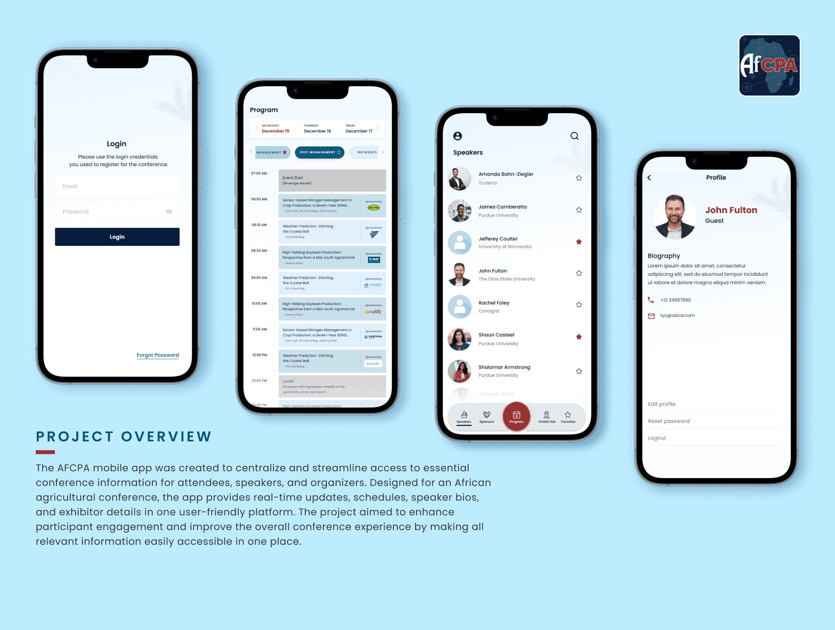
Second Approach: Final Design Screens. (Figma Link of all screens)
Streamlined Navigation: The design prioritizes a clean and intuitive navigation structure, allowing users—whether they are attendees, speakers, or organizers—to effortlessly move through the app and find relevant details without unnecessary steps.
Content-Centered Design: These screens focus on displaying the most important conference details upfront, such as the program, speakers, sponsors, and exhibit hall maps. This approach ensures users can quickly find and access the information they need.
User-Friendly Interface: The interface is designed to be visually appealing yet straightforward, with a focus on functionality. The use of clear icons and consistent typography supports ease of use and quick comprehension.
Professional Aesthetic: The color scheme and overall design maintain a professional look that aligns with the conference's serious and informative nature, reinforcing the app's role as a tool for professionals in the agriculture industry.
Positive Client Feedback: The client favored this iteration for its directness, clarity, and user-focused approach, appreciating how it enhanced the overall conference experience through well-organized content and a refined design.


Design System.


You've hit the footer,
thanks for stopping by.
Still Curious?